The Population of Kerala
In the second map of this series i decided to take on a very simple chloropleth map that shows the distribution of population in the South Indian State of Kerala. A chloropleth map often shows different geographic regions that have been shaded according to particular variable.
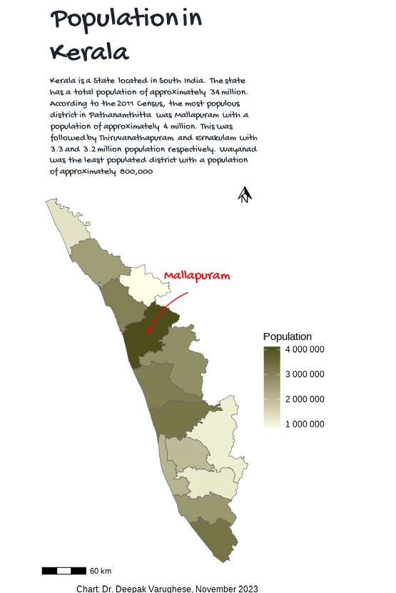
For this map we obtained the administrative borders using overpass from OSM and downloaded the adm_5 layer as adm_5 usually shows the map at the level of district. We then obtained the 2011 Census Data. Yes, this is old census data - but it was the last census that was done. We will assume that overall trends in population may still be the same.
We then used different functions on dplyr and stringR to clean the data and finally performed a left_join to merge the population data into the shapefile.
We then used ggplot2 for the plotting. We experimented a little with fonts and settled on an informal handwritten type font from the googlefonts collection. The colors were handled by RColorBrewer and i picked a green palate to correlate with the lush vegetation present in Kerala. I avoided the temptation to label each and everything and focused on a simple question of “Which is the district with the highest population”. This allowed me to keep the map more clean and stick to communicating a single message.
This was also an exercise in speed as I tried to complete it in limited time rather than focus on the details for too long. Overall a good experience. Hope to keep this going.